Custom Appearance
This document is applicable to LI PASS client V1.10 and later versions, and the LI PASS Web client.
LI PASS provides standard UI templates for quick integration, and also supports custom appearances to align components with your game's style.
Follow the steps in this article to customize the appearance of either the Client or Web client.
Client Custom Appearance
Before starting client customization, you need to understand that current custom appearance consists of basic customization and advanced customization:
-
Basic Customization: Modify common element colors on most interfaces, suitable for light modifications.Such as theme colors, button colors, text colors, etc.
-
Advanced Customization: Allows high-level interface customization including images, logos, decoration graphics, etc.Since most LevelInfinite Pass interactive controls use images for display, replacing images with the same size ratio can achieve a skin-changing effect.
No matter which customization plan you choose, you need to go through three stages: LI PASS UI Editor to prepare resources, deliver LI PASS updates, and self-verification.
Step 1: Prepare UI Resources
Use the LI PASS UI Editor developed by Player Network to prepare UI resources and achieve basic customization for LI PASS login components. See Basic customization for the customization scope.
After finalizing modifications in the LI PASS UI Editor, you can directly export the client UI resources.
Advanced custom UI is supported starting from LI PASS V1.16, see Advanced Customization.
Step 2: Replace Resources
- Unity
- Unreal Engine
Provide the downloaded UI resources to the business contact. The business contact will return a customized AssetBundle. Place the AssetBundle in StreamingAssets/LevelInfinite.
Provide the downloaded UI resources to the business contact, and the business contact will return the customized resources, which include:
- Skin-change images:
Plugins/LevelInfinite/Content/LevelInfinite/Textures - Text color configuration:
Lua/LevelInfiniteFontStyle.lua
After replacing, run to see the corresponding effect
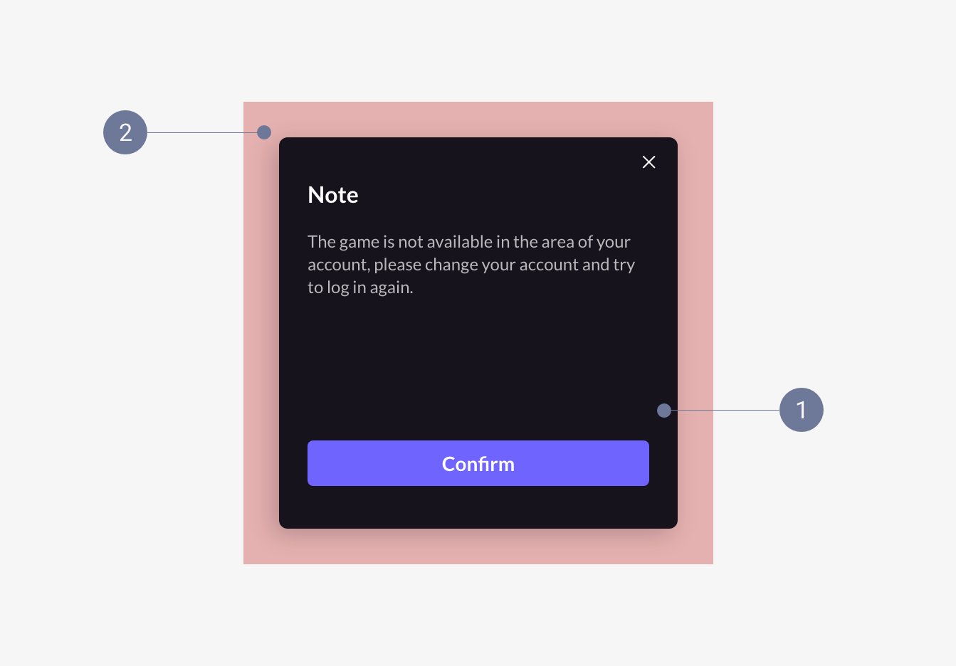
Step 3: Resource Acceptance
Run the game in the editor or on a real device, open the LI PASS interface, and observe if the interface style changes as expected.
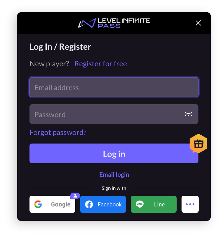
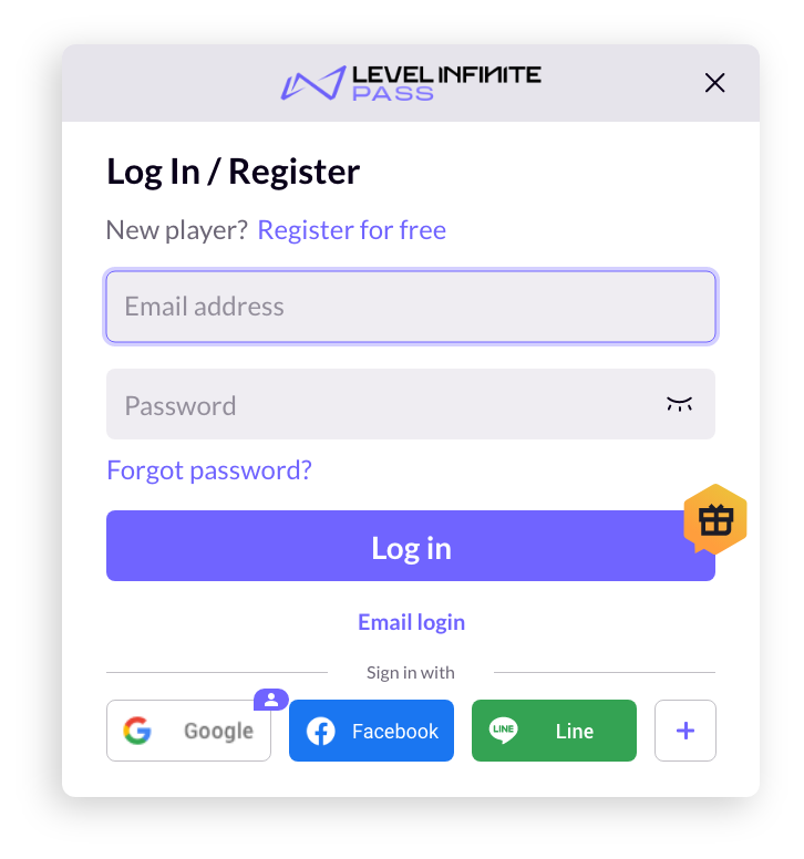
For example, the default dark LI PASS UI has changed to light mode.
Dark mode:
Light mode:
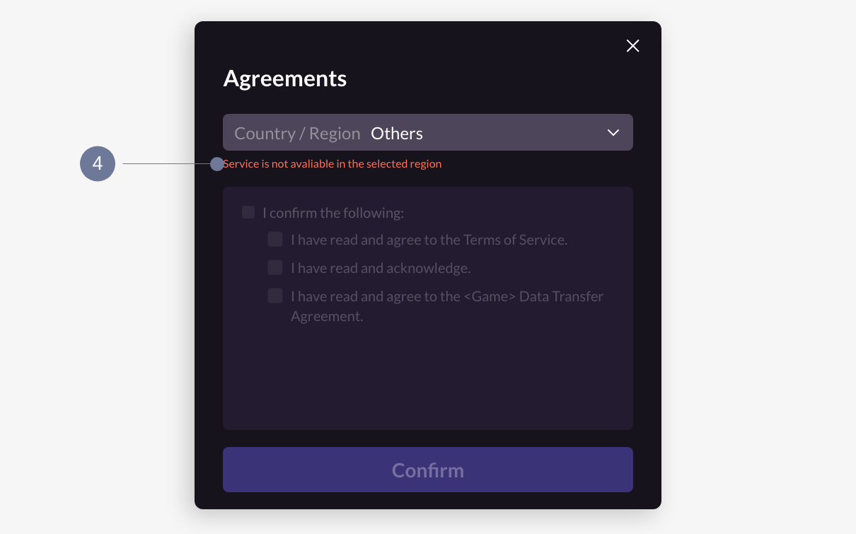
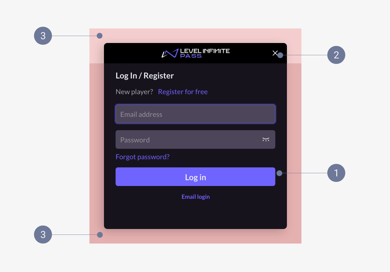
Web Client Custom Appearance
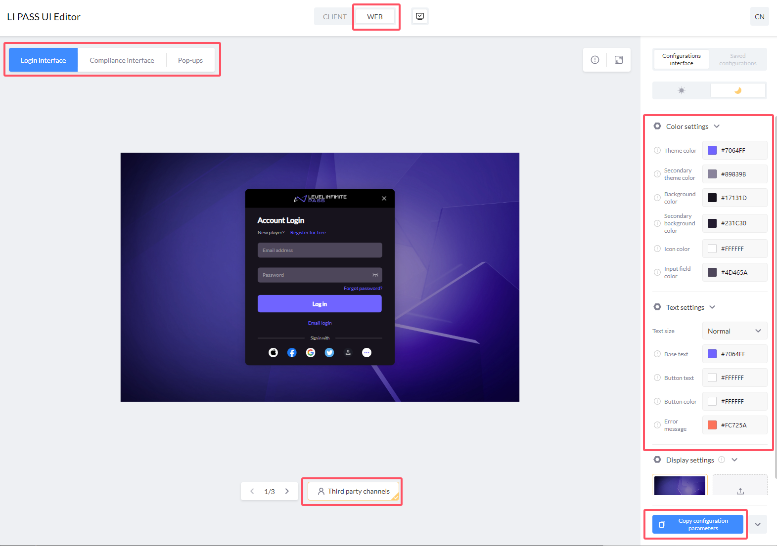
Step 1: Acquire Configuration Parameters
-
Open the LI PASS UI Editor and select Web Client.
-
Debug configurations on the right for previewing Login & Registration Page, Compliance Page, and Popup scenes.Default provides dark and light configurations.
-
After debugging, click Copy Configuration Parameters.
Example:
{
 token: {
 colorPrimary: "#7064FF",
 colorSecondary: "#89839B",
 colorPrimaryBg: "#17131D",
 colorSecondaryBg: "#231C30",
 colorIcon: "#FFFFFF",
 colorInput: "#4D465A",
 fontSize: "MD",
 colorPrimaryText: "#ff6666",
 colorTextBase: "#FFFFFF",
 colorTextButton: "#FFFFFF",
 colorError: "#FC725A",
 },
 algorithm: "dark"
} -
[Optional] After copying the parameters, go to Component example for testing.
- Paste the parameters into the
themeattribute's input box. - Click start to begin the preview.
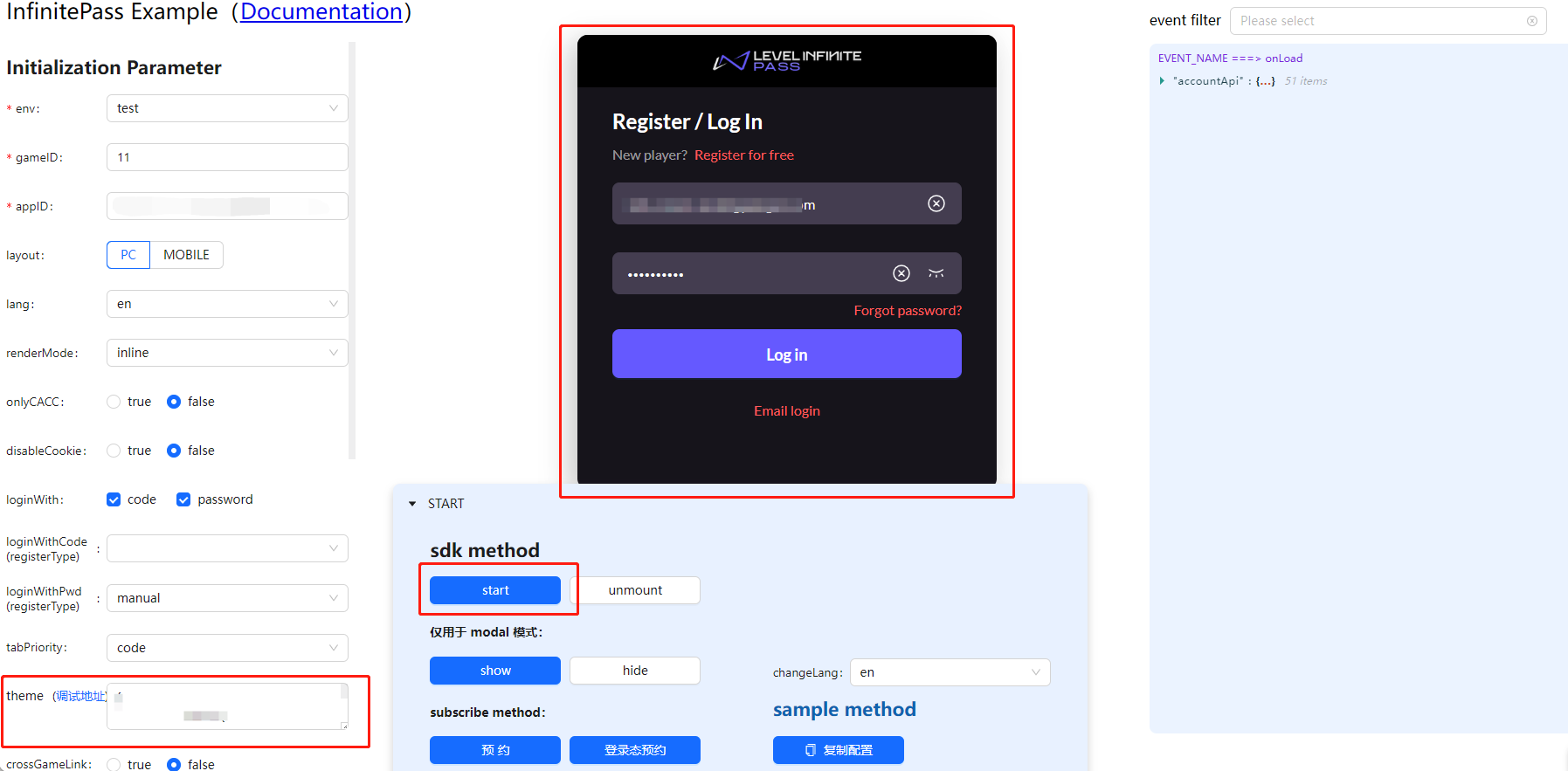
- Paste the parameters into the
Step 2: Configure Component Parameters
Configure the parameters under the theme attribute of the component config.
Example:
// Import component resources
<script src="https://common-web.intlgame.com/sdk-cdn/infinite-pass/latest/index.umd.js"></script>
<link rel="stylesheet" href="https://common-web.intlgame.com/sdk-cdn/infinite-pass/latest/index.css" />

// Fill in the related configuration and theme parameters
const newPass = new PassFactory.Pass({
 env: 'test',
 gameID: 11,
 appID: '0afef39eb02d069107db6e02efd71a2c',
 config: {
 langType: 'en',
 theme: {
 token: {
 colorPrimary: "#7064FF",
 colorSecondary: "#89839B",
 colorPrimaryBg: "#17131D",
 colorSecondaryBg: "#231C30",
 colorIcon: "#FFFFFF",
 colorInput: "#4D465A",
 fontSize: "MD",
 colorPrimaryText: "#ff6666",
 colorTextBase: "#FFFFFF",
 colorTextButton: "#FFFFFF",
 colorError: "#FC725A",
 },
 algorithm: "dark"
 },
 },
});

// Mount pass component
newPass.start('#infinite-pass-component');
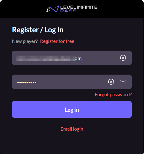
Basic Customization
Basic customization is applicable to LI PASS client V1.10 and later versions, and the LI PASS Web client.
Basic customization includes modifications to graphic colors, text size, and text color.
Graphic Color
- Theme Color
- Secondary Theme Color
- Primary Background Color
- Secondary Background Color
- Icon Color
- Input Box Color
Text Color
- Base Copy
- Text Button
- Graphic Button
- Error Message
Advanced Customization
Advanced customization is applicable to LI PASS client V1.16 and later versions; Web client only supports basic customization.
If basic customization does not meet your game's style requirements, you can manually replace some graphic resources to achieve advanced custom UI.
Due to differences in graphic resources across versions, contact your business contact for specific graphic specification requirements.
Below demonstrates replaceable graphic style examples.Refer to Graphic Handling Method for understanding different graphic handling methods.
Login Panel
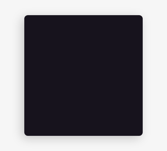
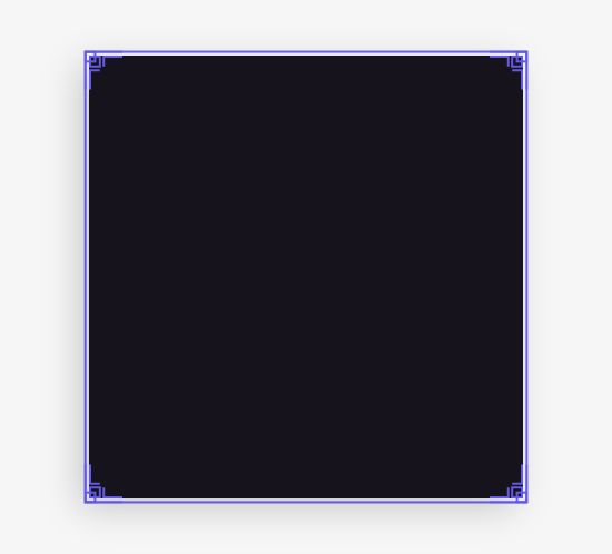
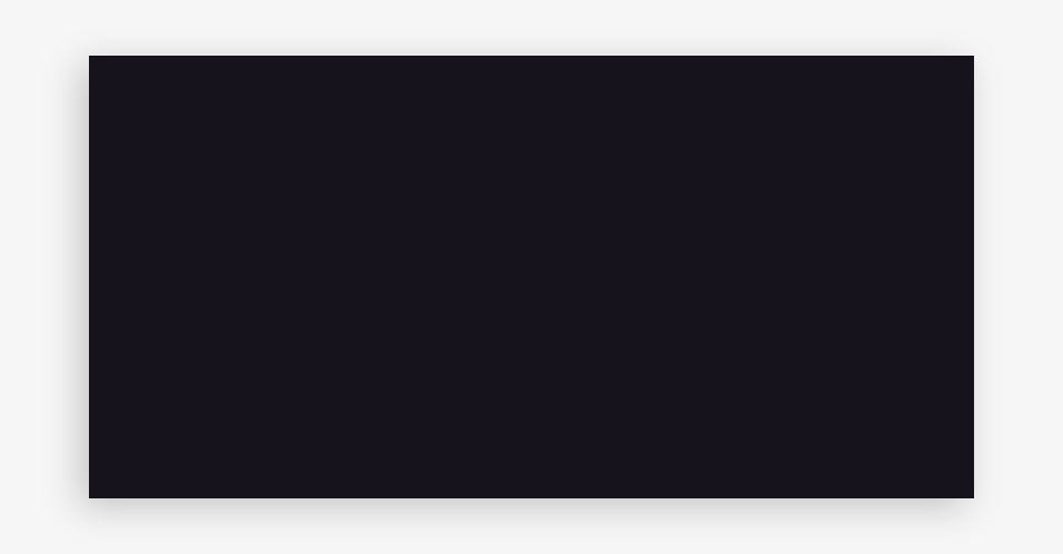
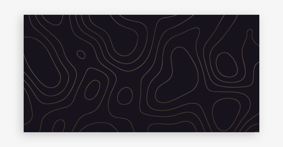
- Main Background: Recommended to maintain consistency with popup's main background, but size can differ.Supports patterns, stretched proportionally.
- Title Bar Background: Supports patterns, stretched in a nine-square grid.
- External Pattern Area: Stretched in a nine-square grid.
Example
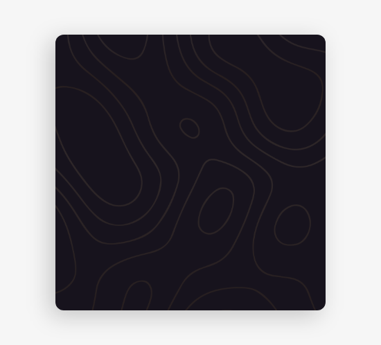
Main Background (Standard Example):

Main Background Pattern:
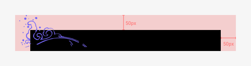
Title Bar Background:

Title Bar Pattern:

External Pattern (Main Background):

External Pattern (Title Bar):


Popup
- Main Background: Recommended to maintain consistency with the login panel's main background, but size can differ.Supports patterns, stretched proportionally.
- External Pattern Area: Stretched in a nine-square grid.
Example
Main Background (Standard Example):
Main Background Pattern:

External Pattern:
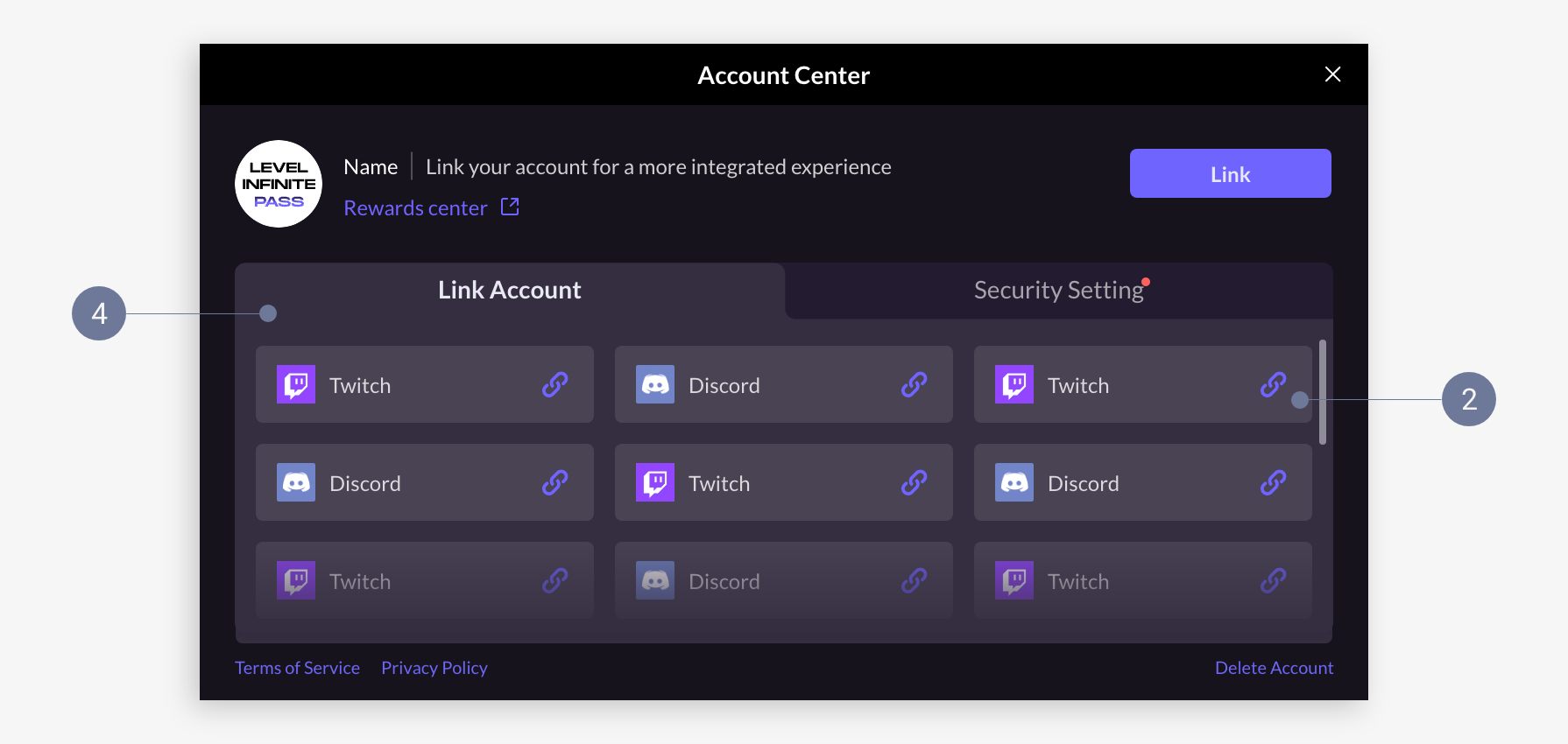
Account Center
Mobile account center is displayed full-screen, while the PC account center is displayed as a popup.

- Mobile
- PC
- Main Background: Supports patterns, stretched proportionally.
- Title Bar Background: Recommended to maintain consistency with the login panel's title bar background, supports patterns, stretched in a nine-square grid.
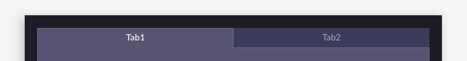
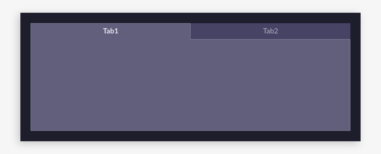
- Tab Background: Composed of Tab 1 and Tab 2, Tab 1 (selected Tab) is spliced with the content area background above and below.Supports adjusting background color, corner angle, replaced in equal size.
- Content Area Background: Supports adjusting background color and corner angle, when adjusting corner angle pay attention to tab background corner connection.Stretched in a nine-square grid.
- Card Background: Supports adjusting background color and corner angle, stretched in a nine-square grid.
- Main Background: Uses the login panel main background graphic resources.
- Title Bar Background: Uses the login panel title bar background graphic resources.
- Tab Background: Composed of Tab 1 and Tab 2, Tab 1 (selected Tab) is spliced with the content area background above and below.Supports adjusting background color, corner angle, replaced in equal size.
- Content Area Background: Supports adjusting background color and corner angle, when adjusting corner angle pay attention to tab background corner connection.Stretched in a nine-square grid.
- Card Background: Supports adjusting background color and corner angle, stretched in a nine-square grid.
Example
Main Background (Standard Example):
Main Background Pattern:
Title Bar Background:

Title Bar Pattern:

Tab Background:
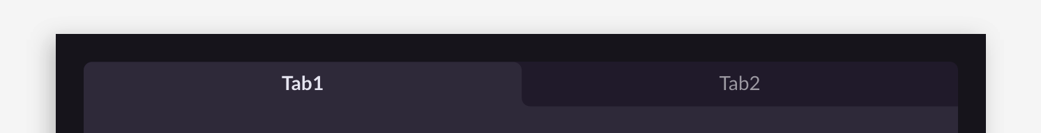
Tab Background (Right Angle):
Content Area Background:
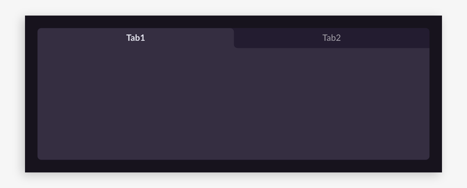
Content Area Background (Right Angle):
Card Background:

Card Background (Right Angle):

Global
Input Box - Support adjusting internal color and border style, border stretched in a nine-square grid.
- Standard Example:

- Border Example:

Filter Box - Support adjusting internal color and border style, border stretched in a nine-square grid.
- Standard Example:

- Border Example:

Filter Box Panel - Support adjusting background color and corner angle, pay attention to corner connection with filter box when adjusting.Stretched in a nine-square grid.
- Standard Example:
- Right Angle Example:
Checkbox: Replaceable without style constraints, provide sizes as needed.

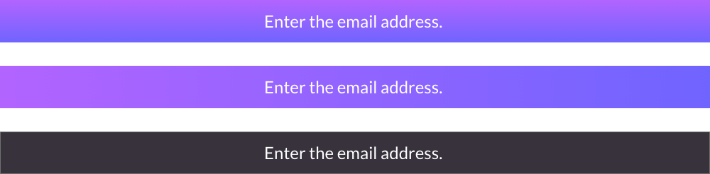
Graphical Button - Stretched using a nine-grid.There are many scenarios for applying graphical buttons where an image needs to be stretched to different widths. If the image has a pattern, it becomes unstable.It is recommended to use solid colors or vertical gradients.
- Standard example:

- Vertical gradient example:

Decorative icon - Replace with equal size without style restrictions, just provide by size.

Functional icon - Replace with equal size without style restrictions, just provide by size.

Toast - Stretched horizontally, it is recommended to use solid colors or horizontal gradients, just provide by size.
- Standard example:

- Other style example:
Channel card - Refers to third-party channel buttons on the login interface, supporting corner angle adjustment, background images are replaced with equal sizes.
Since each channel has its own design guidelines, to avoid affecting the product's normal launch, it is strongly recommended to use the default color.If further style adjustments are needed, please follow the design guidelines of each channel.
- Standard example:

- Right angle example:


Image Processing Method
To control the size of the texture atlas, we have adopted differentiated image processing methods. The following introduction to the processing methods can help designers output more suitable image assets:
-
Equal size replacement: Replace according to the actual size of the graphic, suitable for small graphics such as decorative icons and functional icons.
-
Proportional stretching: Stretch the graphics proportionally to different sizes to ensure the image style is not deformed.
Suitable for simple styles and uniform size ratio graphics, such as main background patterns. -
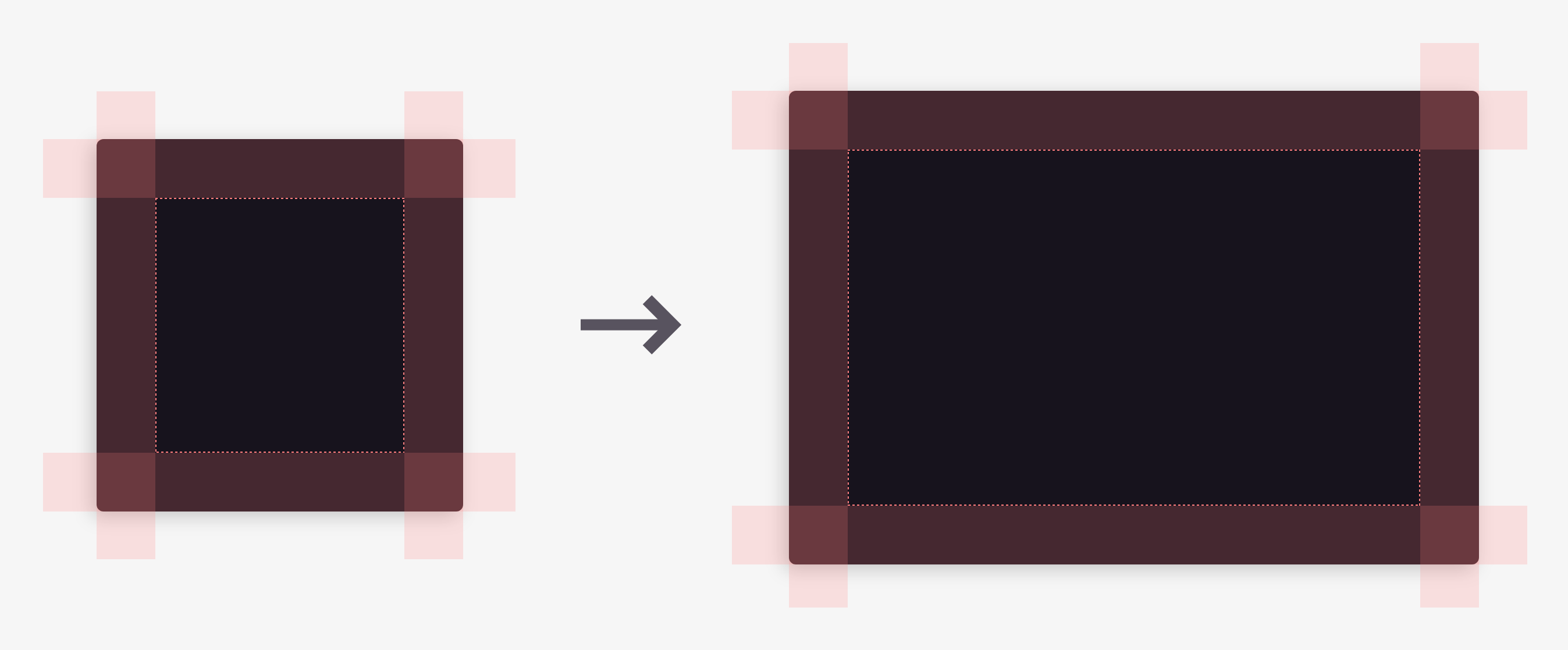
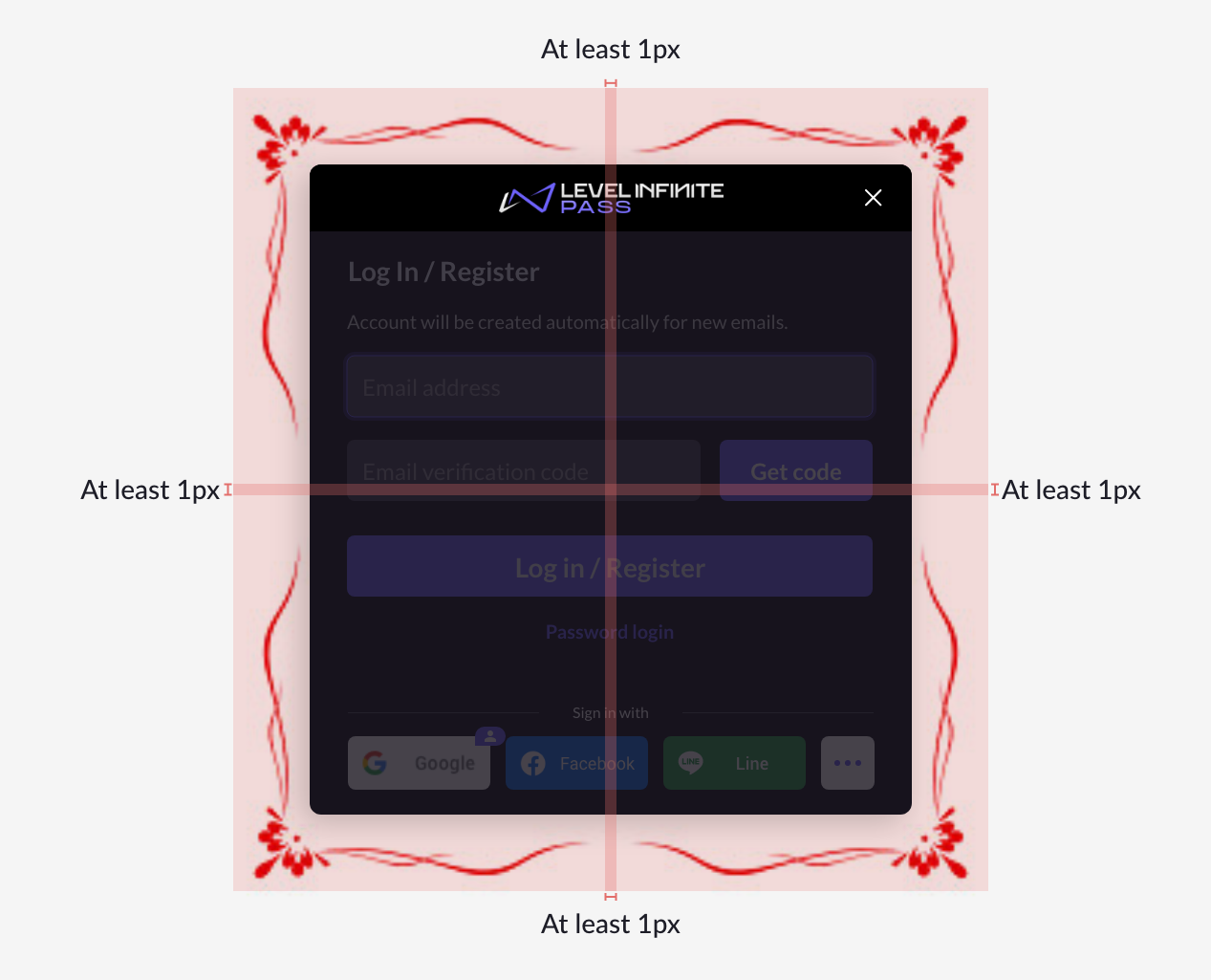
Nine-grid stretching: Divide the graphic into a nine-grid and then apply different scaling strategies to the nine areas to automatically adapt the graphic size to different scenarios.
Suitable for graphics with complex external styles (with borders, icons) and simple internal styles (solid colors, vertical gradients) that need to be stretched to different sizes, such as title bars and graphical buttons.- The patterns on the four corners must not intersect.
- A single pattern must not exceed the midline.
- There should be at least a 1px gap between two adjacent patterns for stretching.
